Design bias in ‘service blueprints’

In many organisations, service blueprints have become a default output. Produced because they are expected, not because they are the best tool. When service blueprints are applied incorrectly, they don't just fail to help, they actively mislead.
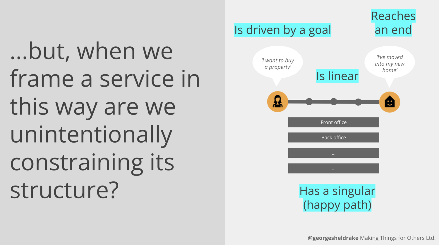
A service blueprint is genuinely useful for showing the depth and structure of a linear, end-to-end journey: the steps, the actors, the backstage processes that make each touchpoint work. However, many services aren't linear. They are cyclic, networked and repeating, used multiple times by the same people across different channels, involving multiple organisations.
When you apply a linear tool to a non-linear service, the tool shapes what you see and how you understand it. Complexity gets flattened or hidden. Journey behaviours get collapsed into a single 'happy path', unless you're willing to make multiple maps, which adds exponential complexity and undermines the point of a singular diagram. Difficult edges, the moments where users loop back, get stuck or fall through, disappear because the format has no place for them. What's left is a clean, logical diagram that represents the easy, well-designed path far more than it represents reality. The blueprint looks complete, the service isn't.

Questions to ask
Before reaching for a service blueprint, it is worth asking:
How often is the service used, and by whom? A service used once is very different from one used repeatedly throughout the year or a lifetime.
Is the service linear, cyclic or repeating? The more networked and complex the journey, the less a single linear diagram can show.
How many organisations are involved? The more complex the network of providers, the harder it is for one diagram to represent reality accurately.
What does the format imply? Does presenting it as a blueprint suggest a level of simplicity, certainty or linear process that isn't realistic?
Could this perceived simplicity be a risk? If so, how do we frame our work so its practical use and its limitations are well understood? A blueprint is an artefact of a moment in time, useful for decision-making, not a completed map to be used in perpetuity.
Who will read this, and how? A diagram that makes sense to a design team may be misread as a definitive picture of reality by a leadership team. Is the level of complexity and detail right for the audience?
Run through these and ask yourself if a blueprint is still the right tool. Do you need to adapt what you have to clarify gaps or hidden complexity? Are there other methods that might serve the problem better?
A recommendation
Choosing the right tool or combination of tools is important. Different levels of detail are often needed for different audiences. Some tools I use alongside service blueprints:
A user-centred system map. This approach starts from the user's goal and traces the full journey to its outcome, including the parts that don't fit neatly into a linear structure. Unlike a blueprint, a system map is designed to expose complexity rather than contain it. Gaps, loops, handoffs between organisations, and moments of uncertainty become visible rather than edited out. It's a more honest artefact, and in my experience, a more useful one for the early stages of complex service work. This type of mapping also connects well to technology and business mapping, helping to bridge enterprise architecture, operations and user-centred perspectives.
Simple journey maps and service diagrams. A tool I often use when sharing service thinking with wider or more senior audiences. The purpose is to show how a journey works at a zoomed-out level, building a shared conceptual understanding across the organisation. This can be a simple map of the journey itself, or a series of diagrams that organise the service framing. These tools help teach the audience what a service is and why it matters to them, while signalling that there is detail beneath each step. Used well, this type of map can surface opportunities at a high level, grow a shared organisational perspective and reduce the siloing and tension that builds when different parts of a business own different parts of the same journey.
The point isn't that service blueprints are a bad tool; they are not. The point is that no tool is neutral; each one shapes what you see and, therefore, what you design. The framework we choose to put our research or perspective within will define how we understand it. Choosing the right tool is part of the work.
——
This connects to a broader pattern I've written about elsewhere, the gap between how services are designed and how they actually work. If that's of interest, take a look at: How to understand ‘services’ as a tool for your whole organisation, How to define ‘service’ and Working services that aren't — and why they keep failing the people who use and deliver them.

A user centred system map
